Four clicks from login to any light's data.
As the Director of User Experience at Ubicquia, I rebuilt Ubivu, its smart-city IoT control dashboard, around color-coded, data-agnostic tiles.
The data existed. It was just buried.
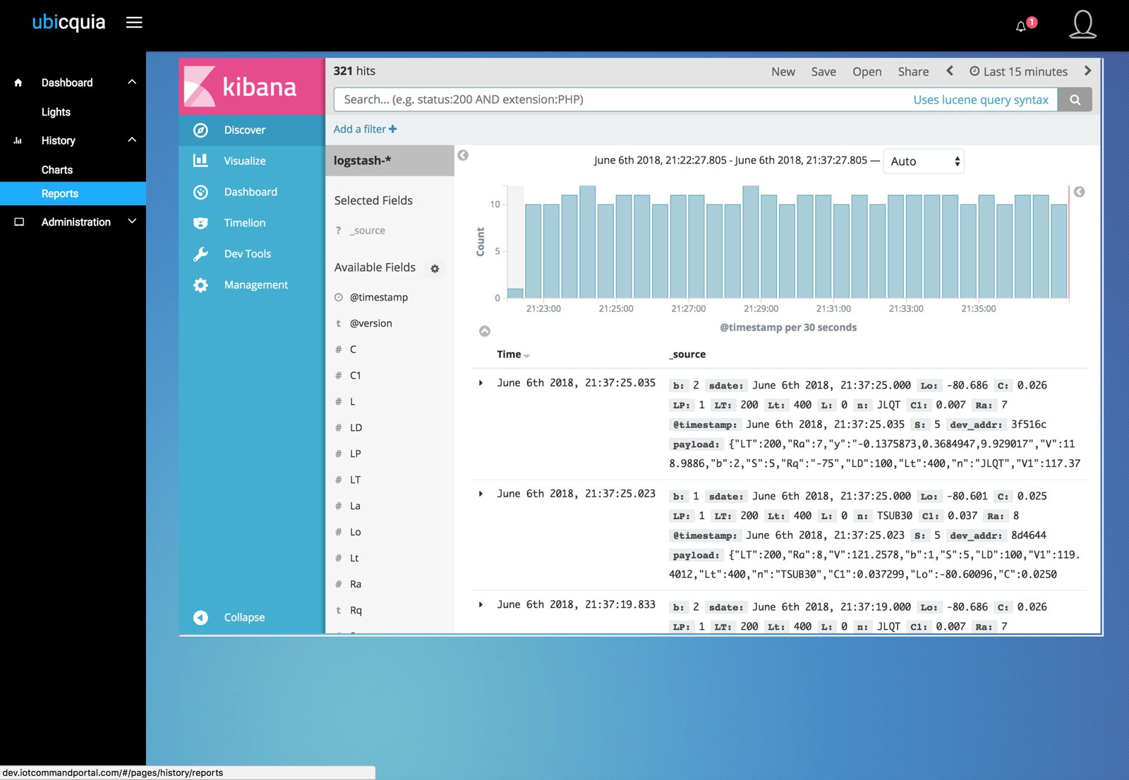
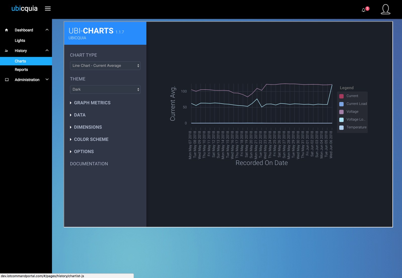
Ubicquia's roughly 500 customers ran their streetlight networks through Ubivu, from small cities with about 10,000 lights to large ones well past 250,000. Version 1 was a patchwork of other software stitched together in iframes: reports opened as a raw Kibana log view, and charts were configured like a developer tool. Each piece was another product to learn, and sometimes another login to remember. Depending on where a user started, reaching the data they needed took 6 to 8 clicks.
The only designer in the building.
As Director of UX and the company's sole creative resource, I owned everything customer-facing. I designed the Ubivu SaaS app and worked with the development team to implement it, leading them through sprints and deliverables. With Marketing, I unified the brand and produced sales sheets, product spec documents, a PowerPoint toolkit and trade-show booths, including Mobile World Congress 2018 in Barcelona. I also directed video and drone crews on product shoots.
Start from the truck roll.
I joined customer calls and meetings, ran surveys, reviewed support tickets and rode along with the service teams in the field. The surveys showed how complex a city's streetlight inventory really is: hundreds of models and brands, often impossible to identify from the ground, even for seasoned crews.
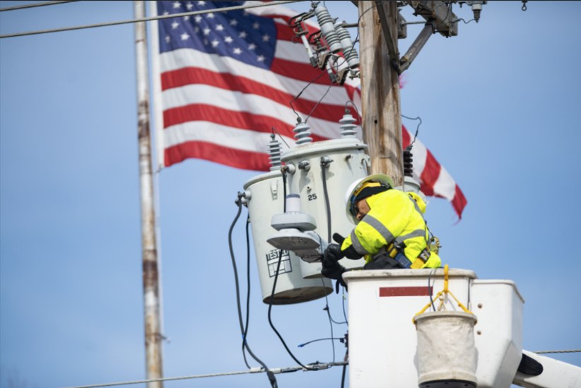
That turned every outage into a cycle. A resident reports a light out somewhere near an intersection. A bucket truck rolls to find it, a crew goes up to identify the fixture and the fault, then goes back for the right part or orders it, and rolls again to install. Competing systems gave cities no visibility to break that cycle. Operators didn't need a better table. They needed to know, at a glance, which light was failing, what it was and why, before a truck ever left the yard.
Situational awareness at the pole level.
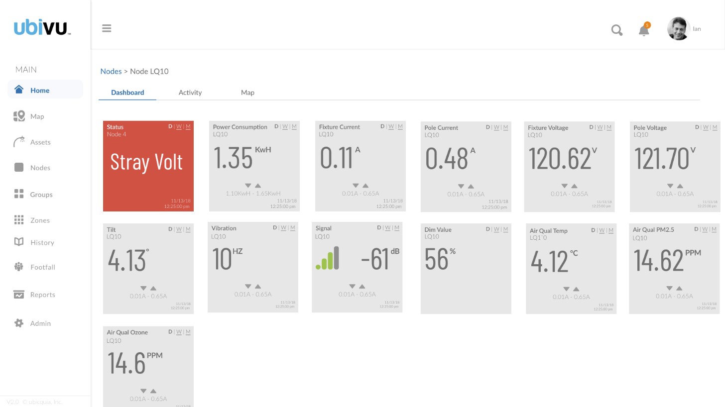
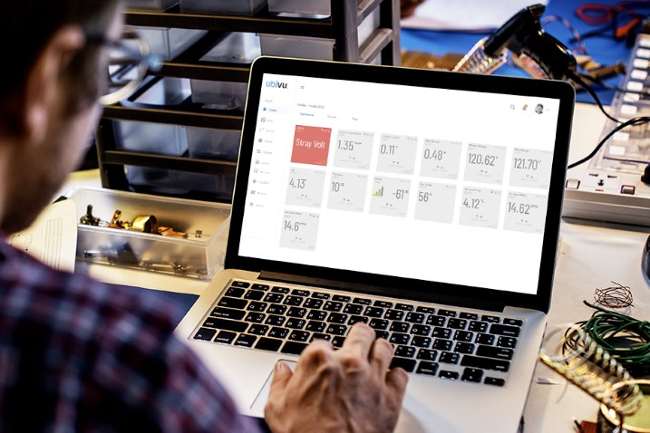
Ubivu put what was happening at each pole on screen: voltage, sway and tilt, inventory and maintenance records, in an interface built first for reading at a glance, from a laptop to a network operations center's wall of screens. Every node gets one dashboard of identical tiles. Power consumption, fixture and pole current and voltage, tilt, vibration, signal strength, dim level, and air temperature, PM2.5 and ozone all share one layout: a big reading, its unit and its normal range. A fault such as stray voltage turns its tile red, so the problem shows before anyone reads a number. From anywhere in the app, any data point is now four clicks away.
The obvious SaaS dashboard.
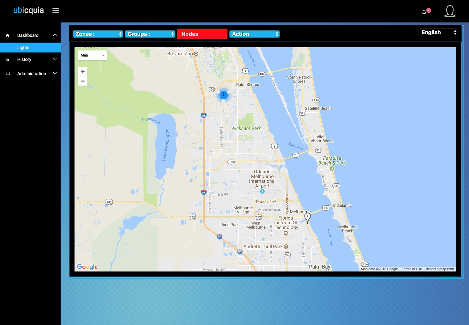
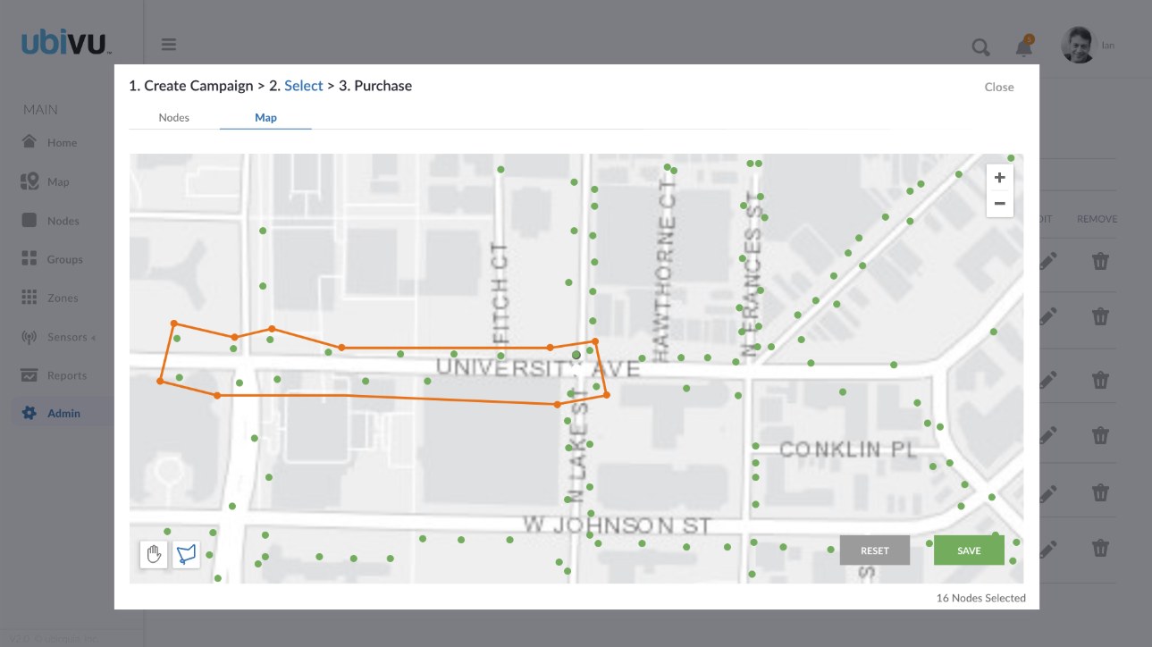
The easy fix was to do what every SaaS company does: a left nav, pages of tables, and a few maps and charts for color. It would have beaten the iframe patchwork. But it wouldn't have helped a network operations center watching a wall of monitors. A table or a map alone can't tell you at a glance that a light is malfunctioning. The real problem was situational awareness, so we designed for that instead.
Design for the glance, not the search. When people act on what they see, the screen should answer the question before they ask it.