One E*TRADE, on the web and the desktop.
I was a key designer on E*TRADE's core trading interface, which stayed in use for more than 20 years, and I redesigned Power E*TRADE, an acquired desktop trading app, to match E*TRADE's web product.
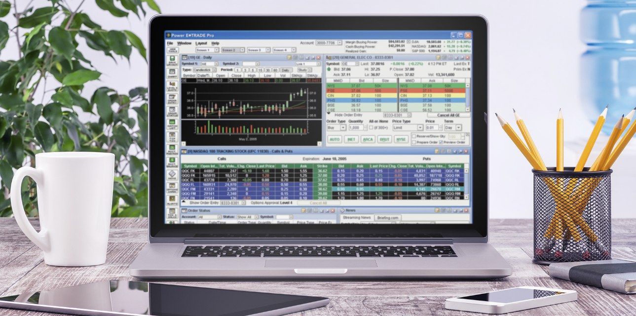
An acquired desktop app that didn't feel like E*TRADE.
E*TRADE bought Power E*TRADE to serve active traders, and it needed to look and work like the rest of the E*TRADE web product. But in the early 2000s it was an executable desktop application, and many of the web conventions we now take for granted didn't translate to it.
Designer across trading, corporate services and the boardroom.
I worked across business units on customer-facing trading interfaces: the core stock trading UI, Power E*TRADE Pro and E*TRADE Pro, E*TRADE Smart Alerts, and the Employee Stock Plan and Equity Edge products for Corporate Services. I also helped redesign the corporate intranet, supported Directions, a leading national conference for stock plan professionals, and built investor presentations and corporate reports with the CEO and Investor Relations.
I was part of a team of about 20 designers, UX specialists and user testers in Menlo Park, California. We worked in pods: a designer, a UX lead, a PM and a group of developers per project, sized to the project's requirements.
Watch traders trade, literally.
E*TRADE had one of the first in-house usability labs: eye-tracking cameras, one-way glass for observing sessions, and a conference area for hosting them. We could see exactly where a trader's eyes went and where they hesitated, and test designs before they shipped.
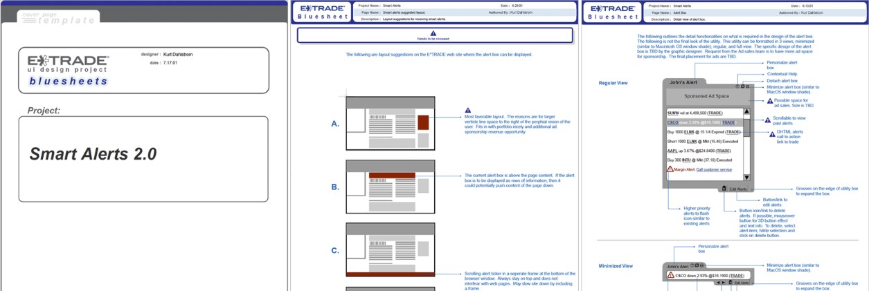
Two interfaces, two kinds of trader.
The core stock trading interface served everyday investors, while Power E*TRADE Pro and E*TRADE Pro gave active and professional traders a denser, faster workspace. Smart Alerts carried the same thinking to notifications. For Power E*TRADE, the work was translation: carrying the web product's look, language and patterns into a desktop application so that traders moving between them felt they were using one E*TRADE.
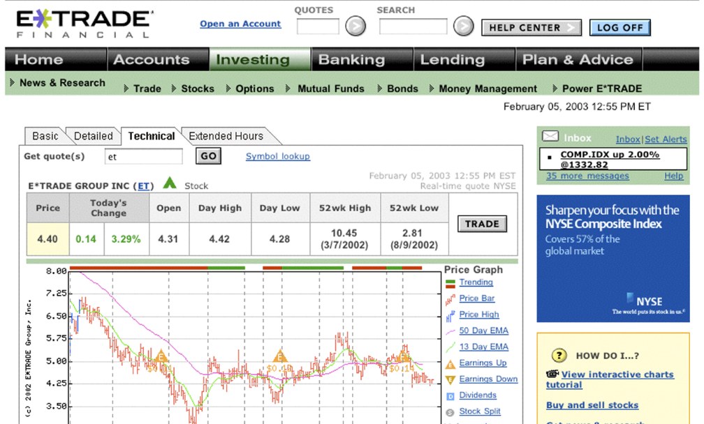
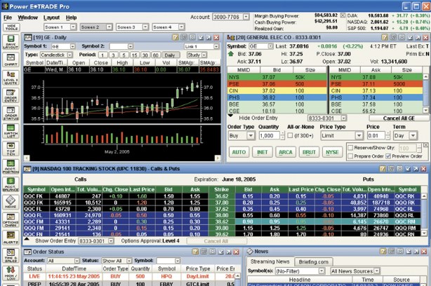
Most first drafts.
Designs were repeatedly torn apart and rethought as they moved through a long approval chain. Some cycles felt endless in the pursuit of perfection, but what shipped was tested, argued over and earned.
Thick skin. A design isn't mine to protect; it's a proposal to be pressure-tested until what's left is what users need.